Welcome to the middle point of our 10 Decades of Vintage Color and Design: the 1950s.
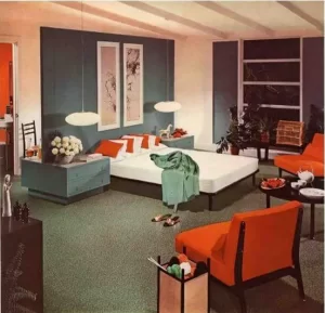
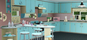
By the 1950s, WWII was behind us and things were looking up. The future was bright and so was the new look of the 1950s. America was booming and people lived a carefree prosperous lifestyle. There was money to be made and spent and new ideas were flowing. Colors were brighter and moved from the pastel tones of the 1940s to bolder shades of bright turquoise, pink and lavender in kitchens and bathrooms and bedrooms.
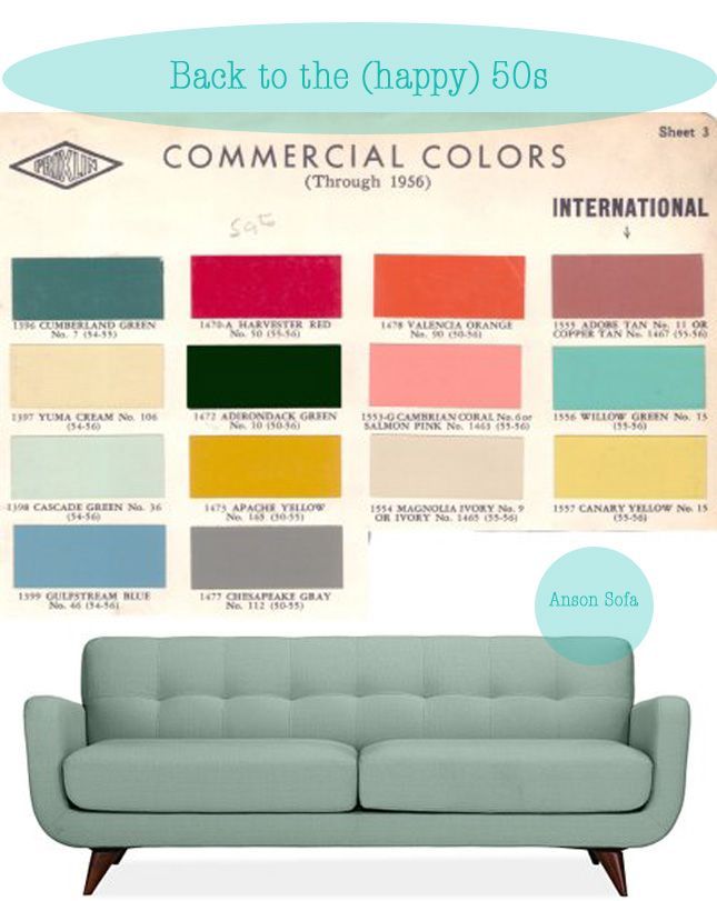
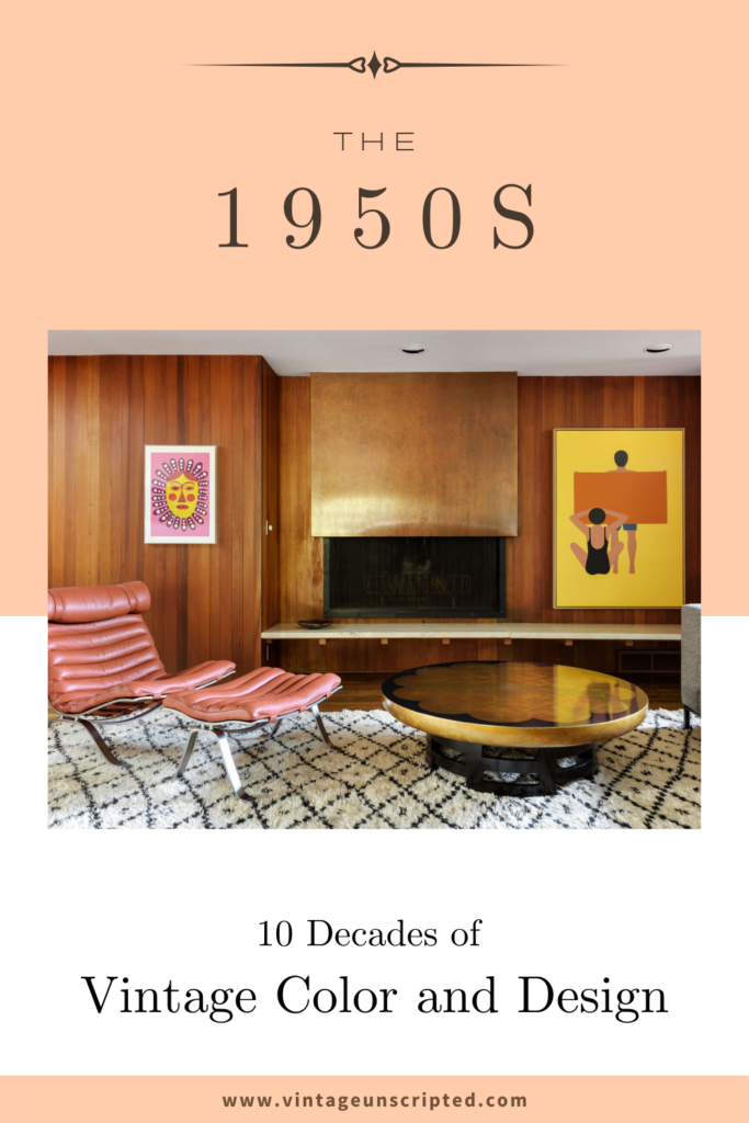
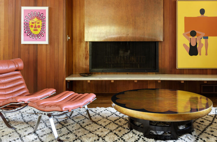
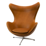
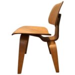
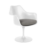
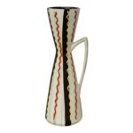
When we look back at the 1950s, we think of sleek Northern European furniture, minimalist decor and sharp angles. Furniture was no longer made to sink into. It was made to stand out. The spare architectural style of design was a stark contrast to the colors and designs of the previous eras. Bold solid colors, simple design, geometric patterns and a new minimalist look came into vogue. Items like the tulip table, Eames chairs and the low-slung lounger gave homes a new look.
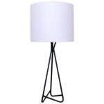
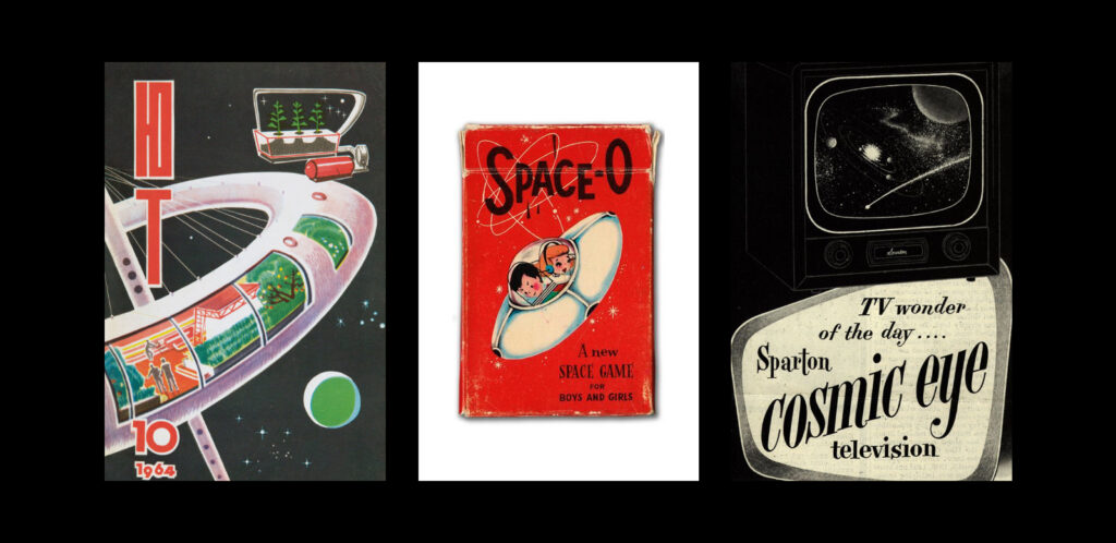
The Atomic age brought us bold looks and experimental ideas. Spiky starburst shapes influenced by the new Space Race were everywhere from lighting to wallpaper.
The clean lines of mid-century furniture are still popular for their non-fussy look which easily fits in with today’s trends. Many 1950s reproductions can be found in big box stores. But the original pieces hold up well over time and are most often higher quality. You can easily get the look with simple clean lines, bold colors and a “less is more” aesthetic. Shapes that are geometric rather than fanciful, as well as solid colors or large bold prints instead of detailed florals, can all help create a 50s look.
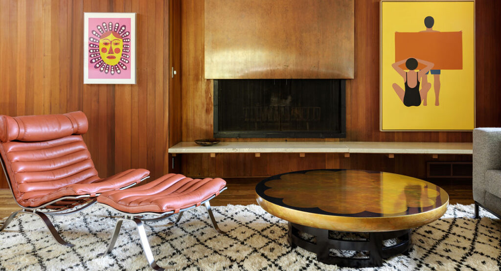
Get the Look of the 1950s:
Notes: Some of the more famous looks in the 1950s came from these designers: Charles and Ray Eames , Arne Jacobsen and Eero Saarinen
Pin It!
